Sugar Queen Case Study
Project Overview
THE PRODUCT
Sugar Queen Cupcakery is a mobile food truck which specializes in cupcakes, confections and coffee. Sugar Queen Cupcakery targets foodies, commuters and loyal sugar-loving customers of all ages.
PRODUCT DURATION
November 2021 to February 2022
THE PROBLEM
The Sugar Queen Cupcakery food truck only accepts orders taken on-site, so the truck’s popularity has created long wait times for their customers. Customers have walked away frustrated due to long wait times and lack of transparency about allergens and other key nutritional information.
THE GOAL
Design an app for Sugar Queen Cupcakery that will allow users to easily view nutritional information about each item and pre-order available items for pickup.
MY ROLE
Lead UX designer overseeing research through final designs for Sugar Queen Cupcakery app
RESPONSIBILITIES
Conducting interviews, paper and digital wireframing, low and high fidelity prototyping, conducting usability studies, accounting for accessibility and iterating on designs
Understanding the User
USER RESEARCH
After conducting a few interviews with local cupcake enthusiasts, I created empathy maps to better understand the users. A common user group discovered through the research process is fast-paced working adults who desire a quick purchase of their favorite dietary friendly cupcake.
PAIN POINTS
1. Long Wait Times: Long customer lines create a slow ordering process and thus the pick-up process is also long.
2. Allergen Risks: Allergens, ingredients and nutritional information is not readily available while waiting in line to order in person.
3. Current Inventory: Users are unable to preview current inventory, leading to frustration at “out of stock” discoveries in person.
Personas, User Journeys, Problem Statements
Persona 1: Jessica Ashley
Problem Statement: Jessica Ashley is a customer with dietary considerations who needs easy access to all ingredients and real-time quantities so that she can safely order without having to waste her time.


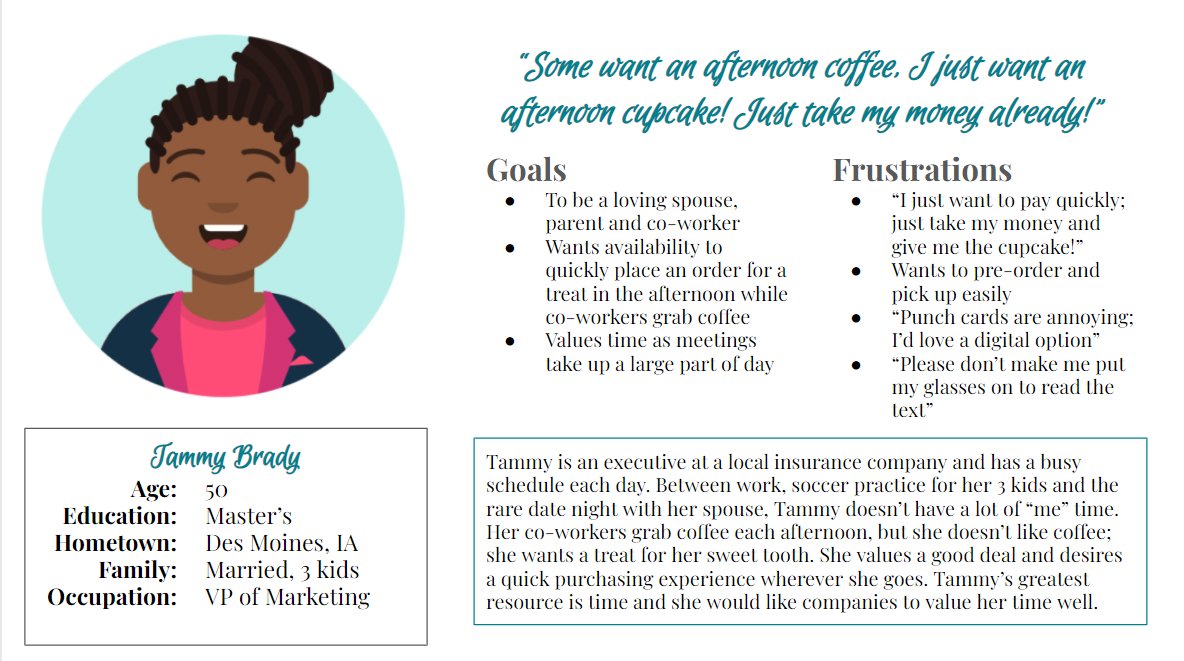
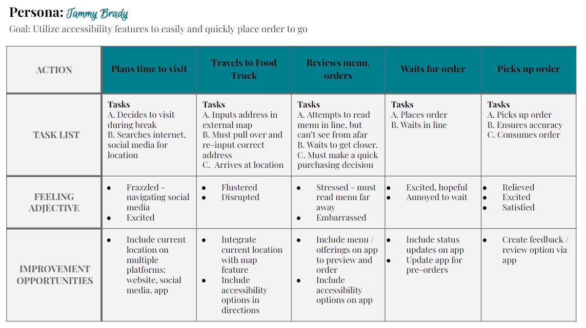
Persona 2: Tammy Brady
Problem Statement: Tammy Brady is a frequent customer who needs accessibility features and an easy purchase experience so that she can use the small break from work to enjoy her treats each day.
Starting the Design
Paper Wireframes

After participating in a few brainstorming exercises, I developed five ideas for a home screen and combined different elements to arrive at the final wireframe for the home screen.
Digital Wireframes
The transition to digital wireframes illuminated the importance of keeping the users’ pain points front and center.
The “Start a New Order” button will utilize a brighter color to indicate the clear starting point for the user
“Find Us” button prominently featured to aid users trying to find the mobile food truck
A sliding carousel of pictures will inspire users who haven’t visited Sugar Queen before
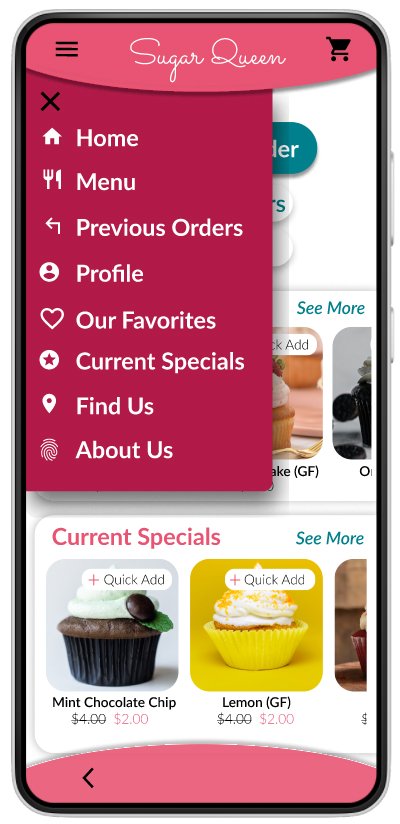
The menu overlay was designed with the user in mind; common pages were included as hot spots. Additionally, the menu was designed to be compatible with screen readers.


Low Fidelity Prototype
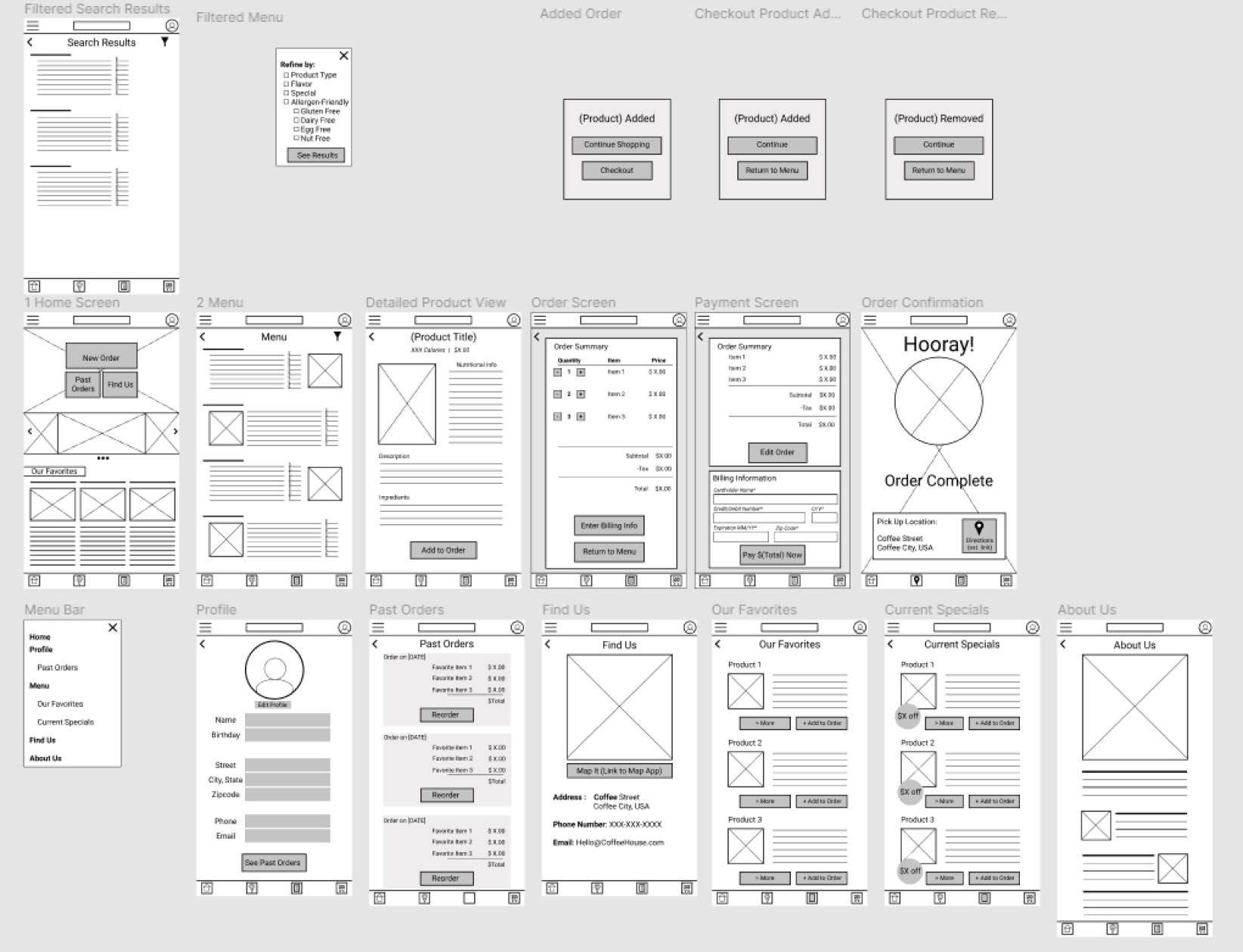
After completing the wireframes for the remaining pages, I then connected all pages to generate a functioning prototype. This prototype was used in usability studies later.
Interact with the Sugar Queen Cupcakery Low-Fidelity Prototype
Usability Studies
Round One (after wireframes)
1. The filter function was too confusing.
2. Users didn’t see a benefit for a profile
3. The confirmation page didn’t give enough information
Round Two (After Lo-Fi Prototypes)
Users preferred fewer icons on the bottom bar and a streamlined color palette for a less cluttered look.
Users were unclear when to pick up their order.
Mockups + Design Iterations
Early designs included a “more” button in the top left instead of the standard menu button. Users were originally unclear what the “more” button did, whereas all customers were familiar with the revised menu icon in the high fidelity design.
The first usability study mentioned confusion around the bottom bar and the menu overlay. The removal of the icons on the bottom bar and a streamlined menu overlay with icons rendered very positive feedback from all users in the second study.
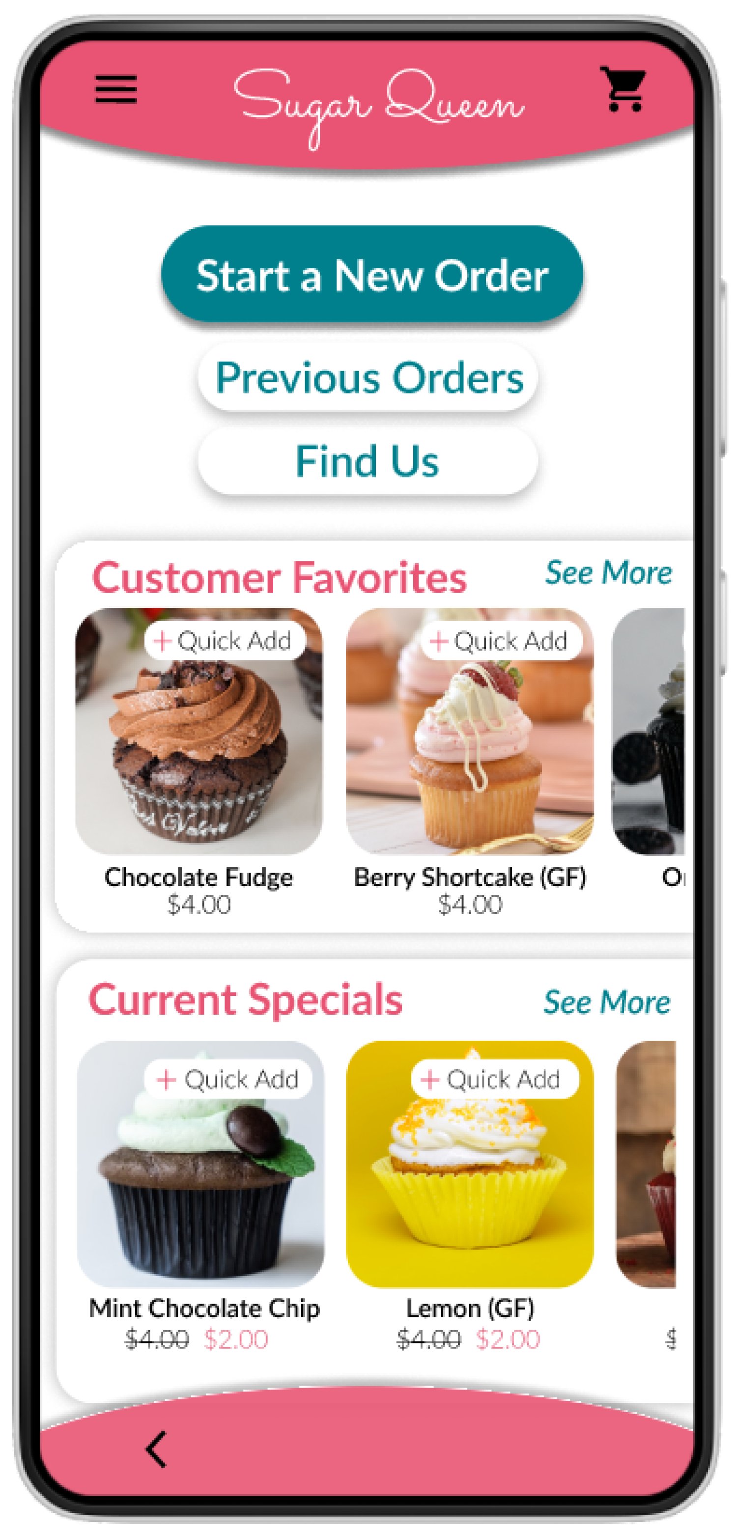
High Fidelity Prototype
The final high fidelity prototype integrated efficient design with user benefits and a cleaner user flow.
Interact with the High Fidelity Prototype.
Accessibility Considerations
Redesigned the menu and pages to include icons and alt text within pictures to assist users with screen readers.
Included potential allergens, nutritional information and ingredients for users with dietary restrictions and allergies.
Takeaways
IMPACT
The Sugar Queen Cupcakery app provides a fun and convenient way for all customers to safely preorder food; especially customers with dietary restrictions.
WHAT I LEARNED
The feedback from customers truly created a better product. The app was more functional, interesting, and helpful as a direct result of listening to the customers’ honest feedback and insight.