
My First Aid Case Study
Project Overview
My First Aid is a multi-platform educational tool designed to equip young adults with basic first aid knowledge and emergency preparedness.
THE PRODUCT
PRODUCT DURATION
March 2022 to April 2022
THE PROBLEM
The My First Aid system seeks to inform, train and equip young adults about first aid and emergency preparedness. Since young adults are often restricted in their ability to attend robust first aid courses in person, a digital option provides young adults with an alternative to learn online.
THE GOAL
Design a responsive website for My First Aid users to access from anywhere with Internet access AND a dedicated mobile app so users can download and access content while in areas away from internet.
MY ROLE
Lead UX designer overseeing research through final designs for My First Aid app and responsive website
RESPONSIBILITIES
Conducting interviews, paper and digital wireframing, low and high fidelity prototyping, conducting usability studies, accounting for accessibility and iterating on designs
Understanding the User
USER RESEARCH
PAIN POINTS
After conducting a few interviews with young adults in the area, I created empathy maps to better understand the users. Additionally, I conducted a competitive audit, to see what current options are available and how these options compare to My First Aid.
Two clear user groups emerged: students seeking to further their first aid education from school and young adults who desire to download course material about first aid from home.
1. Inability to access local courses: Due to age / life stage, many users are unable to travel to local first aid classes or afford expensive courses.
2. Unreliable connectivity: Some users do not have consistently reliable internet and are unable to participate with app/websites when away from wifi.
3. Fragmented learning across devices: Many users encounter difficulties with continuously learning across multiple devices.
Personas, User Journeys, Problem Statements
Persona 1: Susie
Problem Statement: Susie is a middle school student who needs a personalized, multi-platform course on first aid for children because she wants to learn first aid from school and at home.


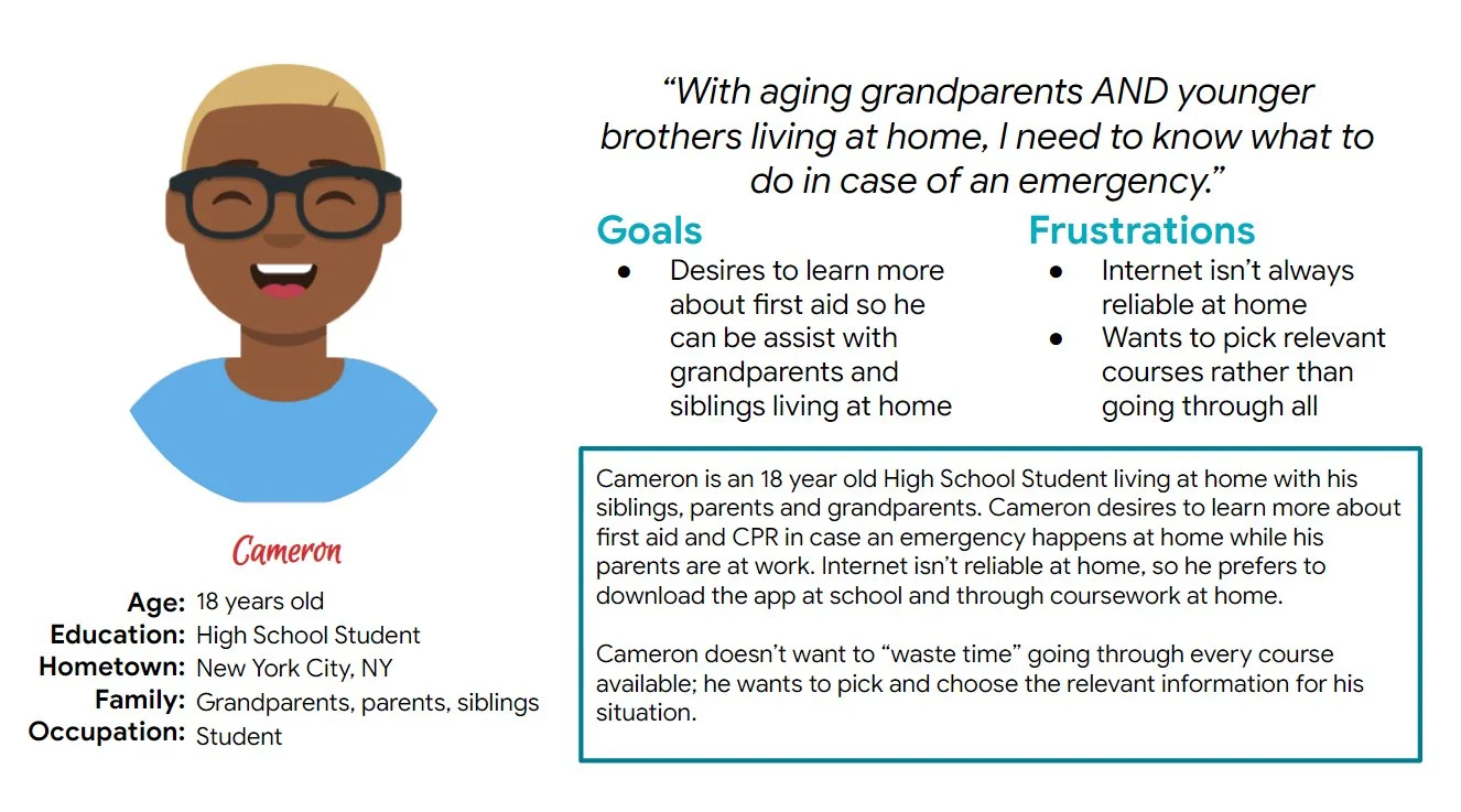
Persona 2: Cameron
Problem Statement: Cameron is a high school student / part-time caregiver who needs a personalized, dedicated mobile app to learn first aid because he would like to learn from home where internet is unreliable.

Starting the Design
Brainstorming + Paper Wireframes
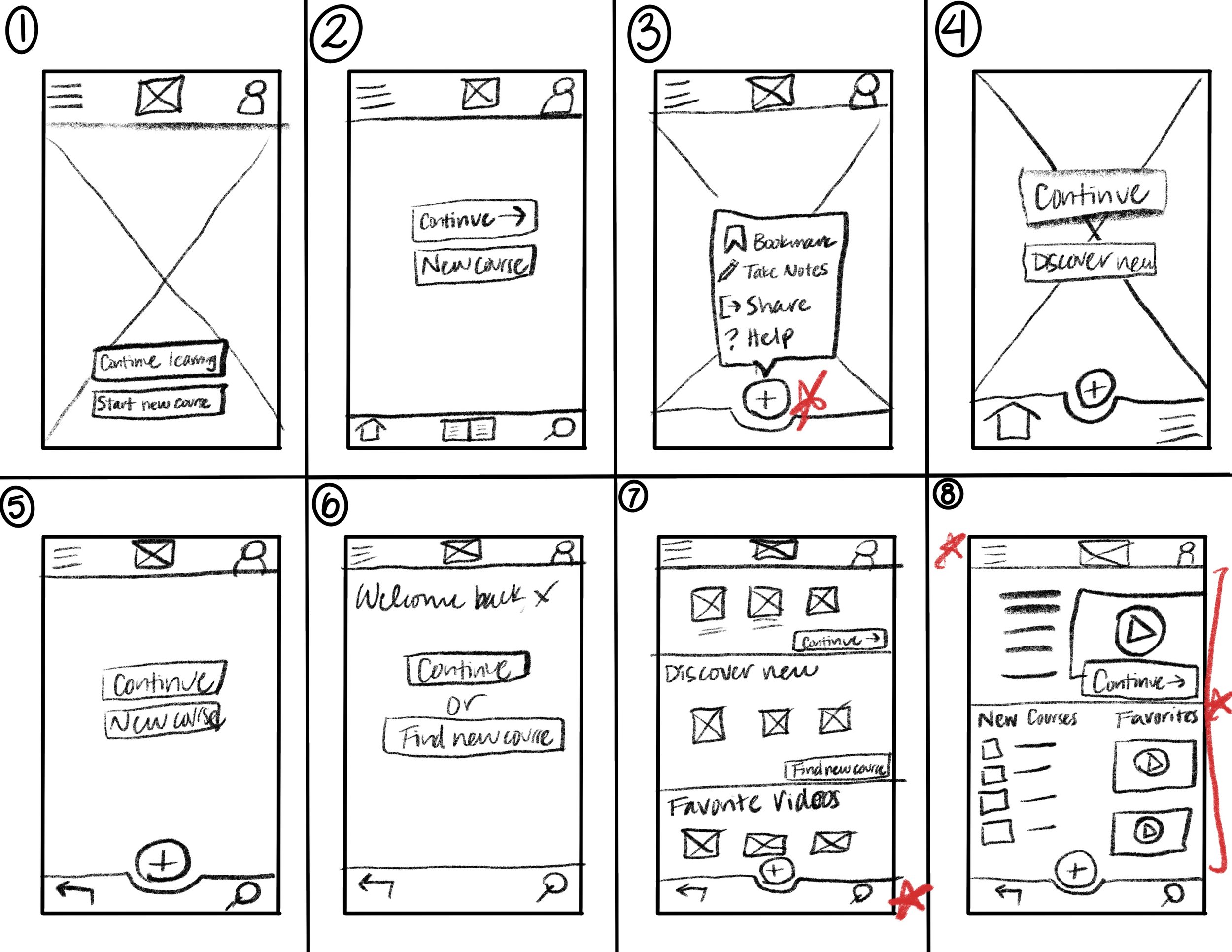
Next, I participated in a few brainstorming activities to develop ideas for the home screen. The image to the right shows the Crazy Eights activity for the home page.
After reviewing customer pain points, the home screen was drafted and iterated with different features and organizations based on customer needs.
Ideation began around the dedicated mobile app with plans to design toward a desktop experience (progressive enhancement).
The final designs reflected a combination of ideas developed in a Crazy Eights exercise. Ultimately, the final screen was chosen with a mixture of elements from most versions. Stars indicate the element chosen in the final iteration.
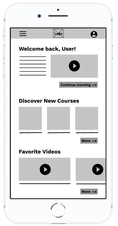
Digital Wireframes
The transition to digital wireframes illuminated the importance of keeping the users’ pain points front and center.
The home page creates easy access back to the learning path in addition to new course options.
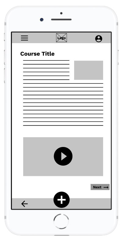
The FAB on each course page provides the user easy access to bookmark a page or take notes.
The menu overlay was designed with the user in mind; common pages were included as hot spots. Additionally, the menu was designed to be compatible with screen readers.
Low Fidelity Prototype

After completing the wireframes for the remaining pages, I then connected all pages to generate a functioning prototype. This prototype was used in usability studies later.
View the My First Aid Low-Fidelity Prototype
Usability Studies
Round One
1. Logo too small: All participants mentioned the inability to clearly see the logo in the menu bar.
2. Feature Breakdown: All participants either could not “like” a video or take notes within the course.
3. Profile Readibility: Participants expressed difficulty reading information on the profile page.
Mockups + Design Iterations
Users noted the difficulty to see (and click) the logo / home button. A redesign creates a more recognizable logo as well as increases visibility of the brand throughout the design.


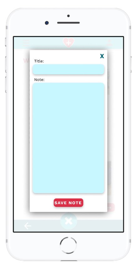
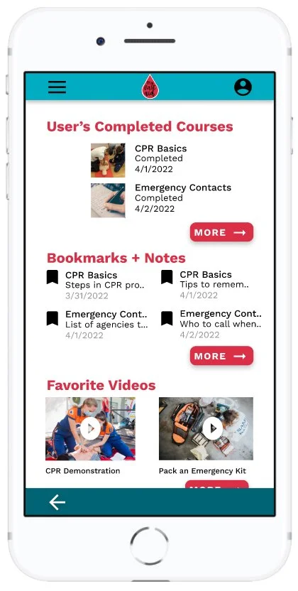
Users noted the inability to “like” a video or take notes, despite having a dedicated section for both in the profile.
The redesign included functionality to like a video, as well as bookmark a spot in the course and take notes.


Users noted a few design flaws and difficulties understanding the purpose of the Bookmarks/Notes section.
The redesign included more white space and as well as adjusting the margins.

High Fidelity Prototype
The final high fidelity prototype integrated efficient design with user benefits and a cleaner user flow.
Link to the High Fidelity Prototype.
Accessibility Considerations
Redesigned the menu and pages to include icons and alt text within pictures to assist users with screen readers.
Considered the color palette, fonts and pictures with accessibility / inclusivity considerations
Takeaways
IMPACT
My First Aid was created with the user in mind; the app and website seek to serve in the gap between young adults and expensive courses.
By creating multi-platform options with connectivity in mind, young adults across the globe can learn life-saving measures to help their community when disaster strikes.
WHAT I LEARNED
The feedback from customers created a better product; the app and website were more functional, interesting, and helpful as a direct result of listening to the customers’ honest feedback and insight.