
Route 66 Case Study
Project Overview
Route 66 Drive-in is a retro-themed movie theater which offers movies for young and old from the comfort of the car. Route 66 targets families, couples, and nostalgia-lovers.
THE PRODUCT
PRODUCT DURATION
February 2022-March 2022
THE PROBLEM
Route 66 Drive-In is a popular locale that serves customers on a first come, first served basis. The theater’s popularity has created long wait times for customers who have to wait in their vehicles outside the theater. Many customers have been turned away when a movie sells out.
Additionally, the theater currently only accepts cash, which lengthens the ordering process.
THE GOAL
Design a flexible website for Route 66 customers that will allow users to easily pre-order and prepay for tickets and food without waiting in line.
MY ROLE
Lead UX designer overseeing research through final designs for the Route 66 website
RESPONSIBILITIES
Conducting interviews, paper and digital wireframing, low and high fidelity prototyping, conducting usability studies, accounting for accessibility and iterating on designs
Understanding the User
USER RESEARCH
After conducting a few interviews with local movie-goers I created empathy maps to better understand the users. A common user group discovered through the research process is “couples chasing nostalgia”. This group desires to be able to reserve tickets and snacks in advance so that decision making on the spot is less stressful.
Another common user group is the “social butterfly”. This group gets frustrated when evening plans with friends are ruined by sell outs and desires the ability to reserve tickets and food in advance with friends.
PAIN POINTS
1. Sell Outs: Customers are often turned away at the theater due to sellouts. Many customers have expressed frustration at a ruined evening.
2. Long Wait Times: Some customers arrive early and wait over an hour to enter the drive-in. Customer lines for food/drink are also long.
3. Slow Transactions: The theater only accepts cash, so transactions at the ticket counter and food booth are difficult for customers without exact change.
Personas, User Journeys, Problem Statements
Persona 1: Billie
Problem Statement: Billie is a social butterfly with a packed social schedule who needs the ability to order tickets in advance so that her evening plans aren’t ruined by a sellout.


Persona 2: Frank
Problem Statement: Frank is a retiree who needs a more inclusive / accessible way to order tickets and snacks so that he doesn’t feel excluded due to hearing impairments.


Starting the Design
Paper Wireframes
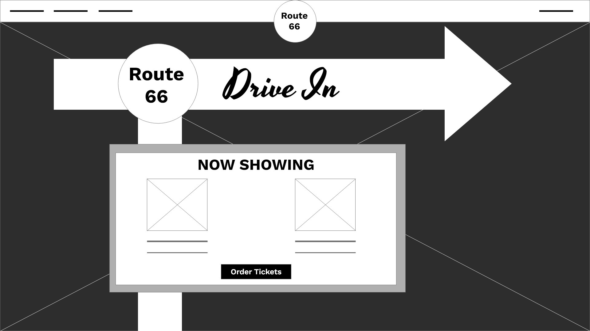
Next, I participated in a few brainstorming activities to develop ideas for the home screen. The image to the right shows the Crazy Eights activity for the home page.
After reviewing customer pain points, the home screen was drafted and iterated with different features and organizations based on customer needs.
Ultimately, the final screen was chosen with a mixture of elements from most versions. Stars indicate the element chosen in the final iteration.

Cross-Platform Digital Wireframes
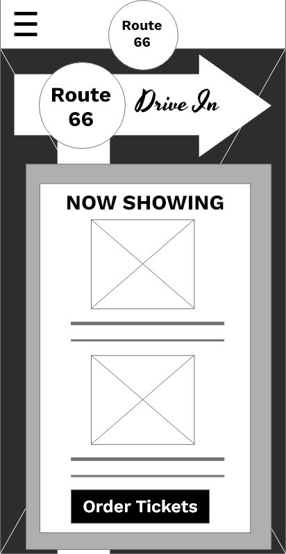
The transition to digital wireframes illuminated the importance of keeping the users’ pain points front and center. In this case study, we were challenged to use Adobe XD to design digital wireframes for mobile phones, tablets and desktop screens.
The desktop version will make use of the top bar and provide “quick links”.
The mobile version will compress images and optimize the use of the screen by adding carousels.
The tablet version will condense some images while using the same drop down menu as the mobile version.
The menu overlay was designed with the user in mind; common pages were included as hot spots. Additionally, the menu was designed to be compatible with screen readers.

Digital Wireframes for Desktop


The menu overlay and simple navigation was designed with the user in mind; common pages were included as hot spots. Additionally, the menu was designed to be compatible with screen readers.
Low Fidelity Prototype

After completing the wireframes for the remaining pages, I then connected all pages to generate a functioning prototype. This prototype was used in usability studies later.
Usability Study
Round One (after wireframes)
Users were unsure about the date/time of ticket purchase
Users were unclear when to pick up their food
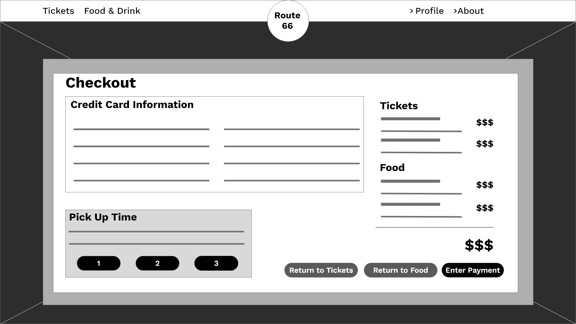
The checkout menu was too cluttered
Users preferred an option to order food immediately instead of just pre-ordering food.
Mockups + Design Iterations


Early designs included a “more” button in the top left instead of the standard menu button. Users were originally unclear what the “more” button did, whereas all customers were familiar with the revised menu icon in the high fidelity design.


The first usability study mentioned confusion around the bottom bar and the menu overlay. The removal of the icons on the bottom bar and a streamlined menu overlay with icons rendered very positive feedback from all users in the second study.


Early designs included a “one stop” page for the Order Summary, Food Pickup, and Payment Input. After the usability study, the three items were split into three stages within the same page. By dividing the sections, users can focus on one item at a time without feeling overwhelmed by information.
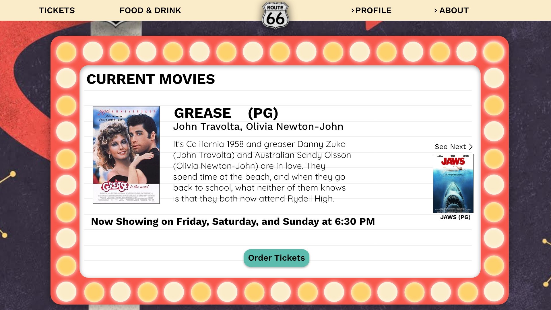

The “Browse Current Movies” and “Confirmation” pages reflect the same theme of the website while keeping the user flow front and center. Users can view more information about each movie and are then ushered to the tickets page. The Confirmation Page includes needed information along with options to email / print the confirmation.
High Fidelity Prototype
The final high fidelity prototype integrated efficient design with user benefits and a cleaner user flow.
Link to the High Fidelity Prototype.
Accessibility Considerations
Redesigned the menu and pages to include icons and alt text within pictures to assist users with screen readers.
Created simple menus and decluttered pages to decrease confusion.
Takeaways
IMPACT
The Route 66 Drive-In websites provides a fun and convenient way for all customers to pre-order tickets and food, browse movies and learn more about the nostalgic drive-in.
WHAT I LEARNED
The feedback from customers truly created a better product. The website was more functional, interesting, and helpful as a direct result of listening to the customers’ feedback and insight.