The Coffee Department Case Study


Project Overview
THE PRODUCT
The Coffee Department is a local coffeehouse specializing in high-end coffee “from bean to beverage”. Their menu includes whole beans for purchase, various coffee beverages, and some light snacks.
PRODUCT DURATION
July 2022 to September 2022
THE PROBLEM
During busy times, wait times can be extremely long. The Coffee Department only accepts orders taken on-site, so customers do not have a way to order ahead. Customers feel pressured to order quickly due to long lines, which can be stressful for customers with large orders. Some customers have walked away frustrated due to long wait times.
THE GOAL
Design a multi-platform mobile, tablet, and website for the Coffee Department that will allow users to easily view the menu and pre-order available items.
MY ROLE
Lead UX designer overseeing research through final designs for the Coffee Department mobile + website
RESPONSIBILITIES
Conducting interviews, paper and digital wireframing, low and high fidelity prototyping, conducting usability studies, accounting for accessibility and iterating on designs
Understanding the User
USER RESEARCH
After conducting a few interviews with local coffee enthusiasts, I created empathy maps to better understand the users.
PAIN POINTS
1. Long Wait Times: Long customer lines create a slow ordering process and thus the pick-up process is also long.
2. Large Group Orders: Large group orders are difficult to place in person and challenging for customers to coordinate payment.
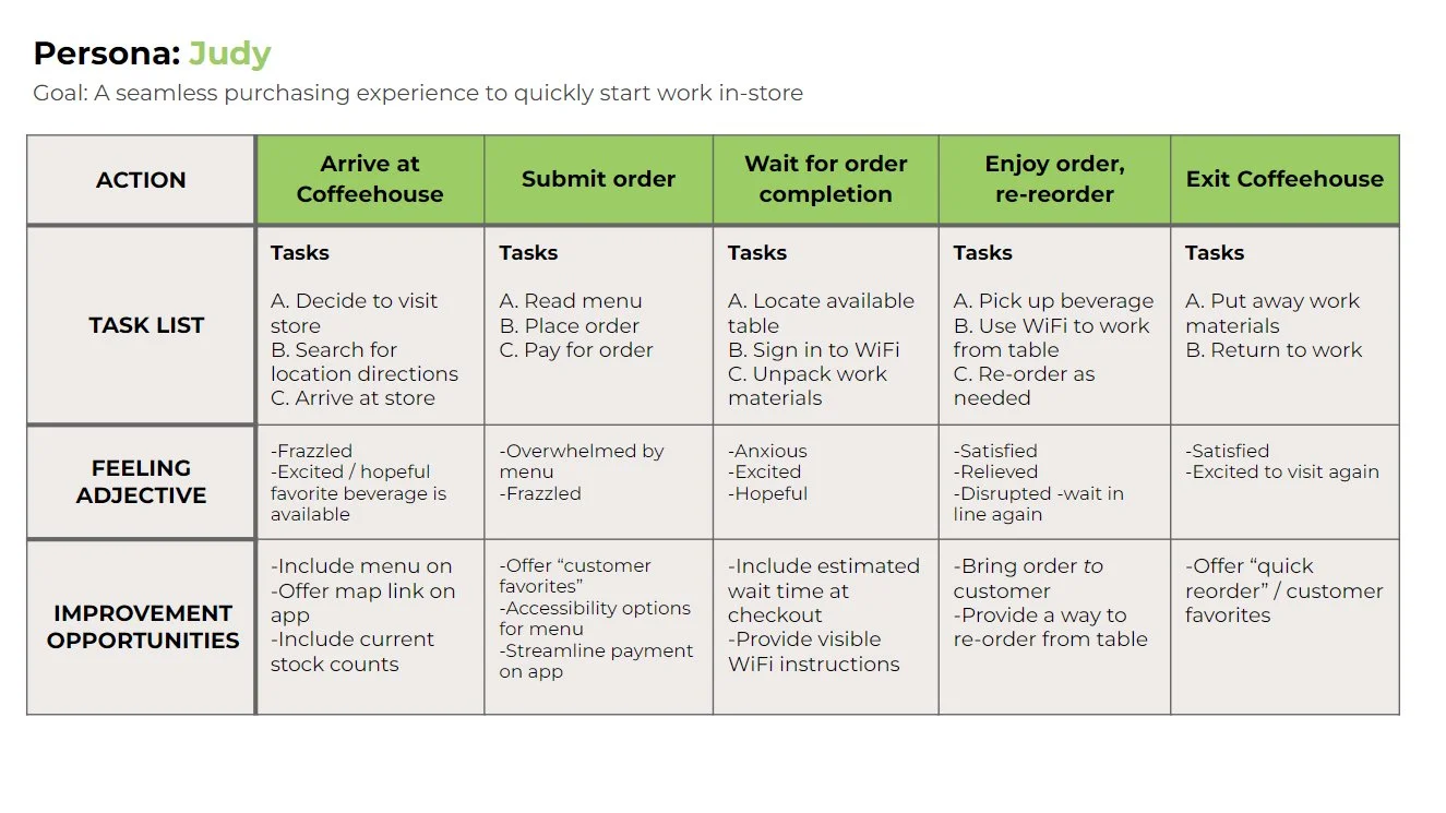
Personas, User Journeys, Problem Statements
Persona 1: Ryan
Problem Statement: Ryan is a mobile ordering customer who wants to bring hot and fresh coffee beverages to coworkers so that he can be viewed favorably as an intern at work.


Persona 2: Judy
Problem Statement: Judy is a dine-in customer who wants to order and re-order her drinks quickly so that she can efficiently work from the coffeehouse.

Starting the Design
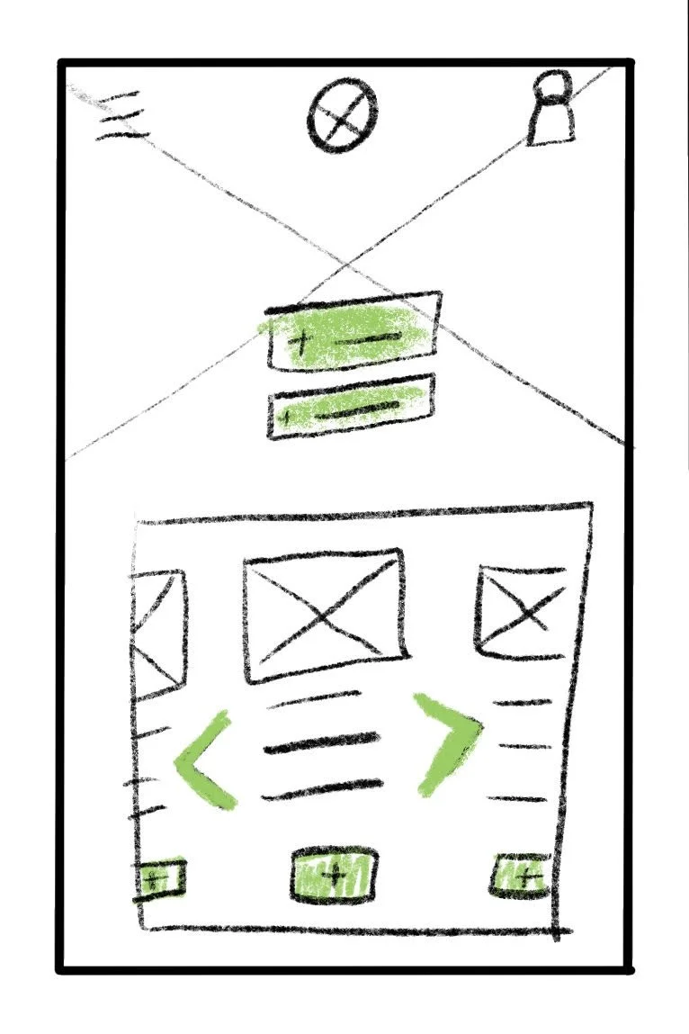
Paper Wireframes

Crazy Eights Exercise for Desktop Home Screen
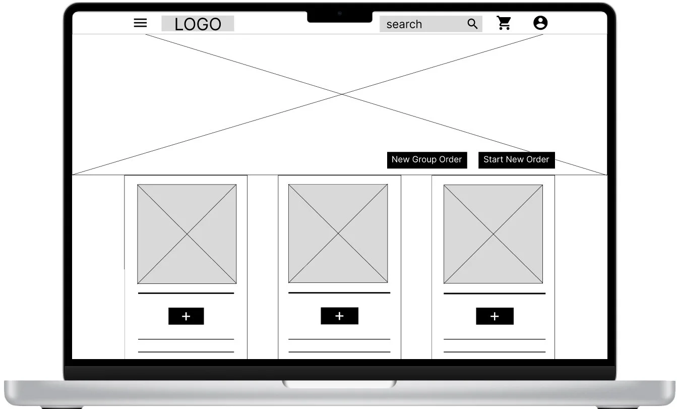
After participating in a few brainstorming exercises like Crazy Eights, I developed eight ideas for a desktop home screen on Procreate and combined different elements to arrive at the final wireframe for the home screen. The elements were chosen so that the homepage would transition well between different screen sizes like tablets and mobile phones.
Rather than listing the popular links on the top bar, all links will be included in a hamburger menu. This feature will transfer well between tablets and mobile screens.
The two main action buttons will feature prominently towards the top of the screen and will feature a pop of color to start the user journey.
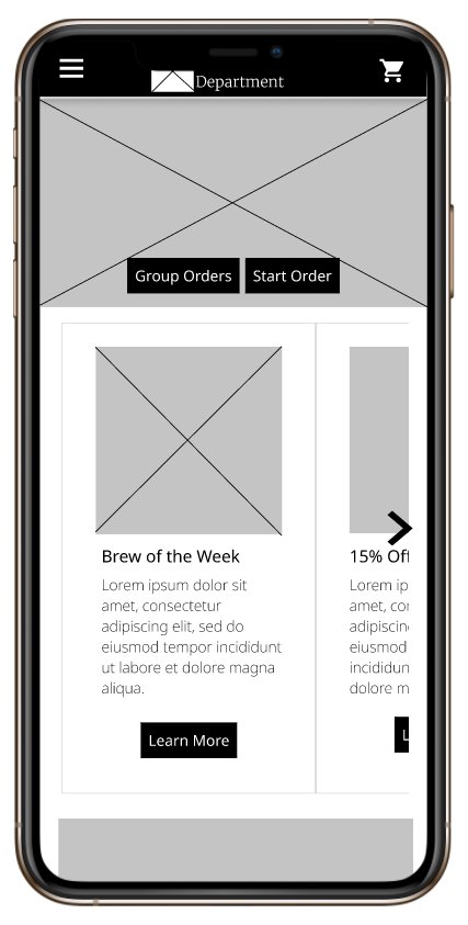
Mobile Home Screen with key elements
Digital Wireframes
The transition to digital wireframes illuminated the importance of keeping the users’ pain points front and center.
The “Start a New Order” button will utilize a brighter color to indicate a clear starting point for the user. The “New Group Order” button explains how to order as a group.
The feature photos on the desktop and the sliding carousel of pictures on the mobile home screen will inspire users who haven’t visited The Coffee Department before.
Low Fidelity Prototype
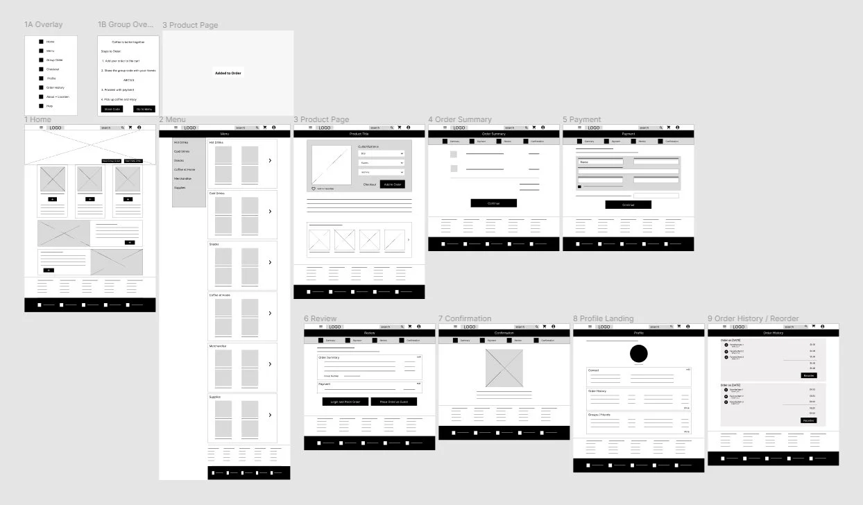
After completing the wireframes for the remaining pages, I then connected all pages to generate a functioning prototype. This prototype was used in usability studies later.
Interact with The Coffee Department Low-Fidelity Prototype
Usability Studies: Round One
Round One (after Lo-Fi Prototypes)
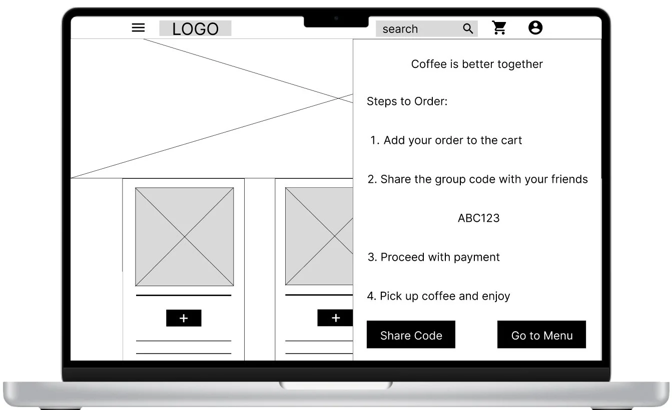
1. There wasn’t enough information about how to order as a group.
2. Not a way to add tips for good service
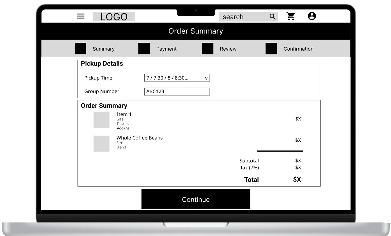
In Round One, users interacted with a low fidelity desktop prototype. Two main issues arose as users went through the user flow: confusion around group ordering and the inability to add a tip. In the low fidelity prototype, users would see a pop up window when they selected “group order” with brief instructions. Users were confused about how to share the group code and if they would need a new group code every time they ordered. They were also confused about payment and were concerned that they would need to pay for all of the orders. A second issue that arose was the inability to leave a tip for good service. Users didn’t want to leave a tip in person (with cash) and preferred to leave a tip with their credit card.
Mockups + Design Iterations
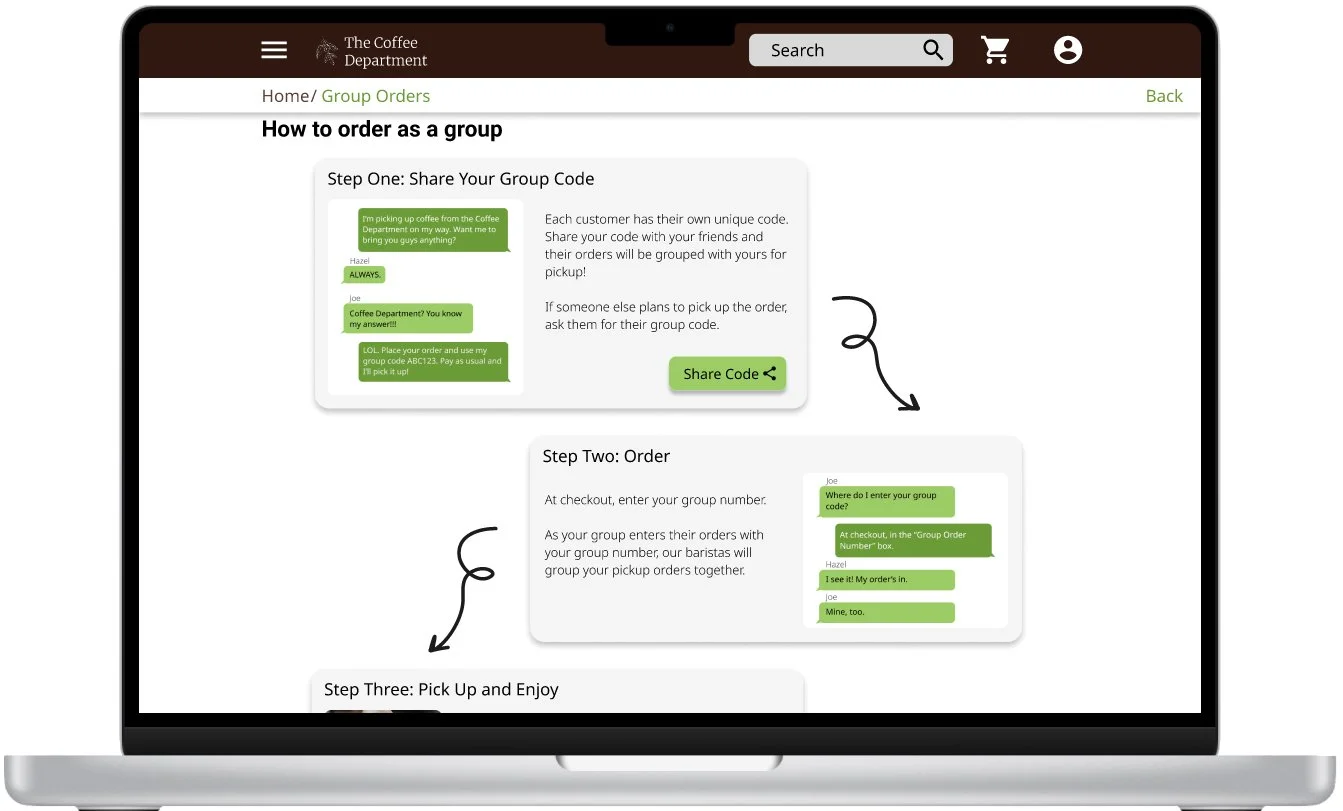
Usability testing revealed that users were unclear about how to use a group code.
The pop-up menu was replaced with a page explaining how to use a “group code”. The page also includes a “Frequently Asked Questions”.
The first usability study also revealed an inability to add a tip for great service.
The mockups and prototype added the ability to rate your order and leave a tip after the order is complete.
No only is this feature helpful for customers, but the rating feature gives feedback to the Coffee Department about their customers’ experience.


High Fidelity Prototype
The final high fidelity prototype integrated efficient design with user benefits and a cleaner user flow.
Interact with the High Fidelity Prototype.
Usability Studies: Round Two
Round Two (After Hi-Fi Prototypes)
There isn’t a way to “leave a note” for additional preferences.
No way to add discounts / coupons at checkout.
Opportunity for greater group interaction (adding “friends”, notification when all group has ordered, etc)
Round two usability studies with the high fidelity prototypes provided another opportunity to better serve the user. One opportunity that came up was the inability to “leave a note” to the barista with concerns or requests. For example. someone with food allergies may need to communicate intolerances to the barista. Other users mentioned the inability to add a discount or coupon code in checkout. Lastly, all users responded positively to the introduction of the “group code” page. A few users mentioned the opportunity to expand group features. For example, one user mentioned that she’d like to “save a group order” with her same group of friends. Another user mentioned the idea of notifying the “host” when someone has placed an order, or a final notification once all orders are in / ready. More research into technical capability and system integration is needed before embarking on the addition of the group features.
Takeaways
IMPACT
The Coffee Department website provides opportunities across different devices for customers to interact with their company. Customers are able to view the menu, preorder, order as a group, and easily reorder. Similarly, the Coffee Department is better able to understand their customers and plan ahead. The review / tip feature creates an easy way to gain feedback from customers about their purchase and interaction with their barista.
WHAT I LEARNED
As usual, feedback from users and customers created opportunities for better features within the website. The generosity of our users (the desire to leave a tip for their favorite barista) led to key breakthrough: users are better able to leave feedback and they can easily leave a digital tip. Not only do the customers benefit from this feature, but the Coffee Department is able to track performance and learn more about their customers.